Basic Color Theory
Red, yellow, and blue are called primary colors because they cannot be mixed in their pure state by combining other colors. Green, orange, and violet are called secondary colors because each is a mixture of two primary colors. Blue and yellow combine to make green, red and blue combine to make violet, and yellow and red make orange. These are placed in a circle, with the secondary colors between their component primary colors. Colors located between a primary and a secondary color are called tertiary colors. They include yellow-green, red-violet, blue-green, and so on. The subdivisions of the color wheel are continued for as long as there is a perceptible difference between two colors.
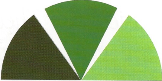
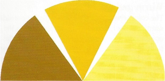
Warm and Cool Colors
The color wheel is divided into what are considered warm and cool colors. ln the illustration on the opposite page, the warm colors are those 10 the right of yellow at the top and violet at the bottom; cool colors are those to the left of yellow and violet. Pure violet and pure yellow are neither warm nor cool; they represent the borders between the two divisions. A yellow with the smallest amount of orange in it is considered warm, while a yellow with the smallest amount of green in it is considered cool. A reddish violet is warm, a bluish violet is cool. Warm and cool are relative terms, of course; a warm color located near the border between warm and cool is said to be cooler. For example, orange is a warmer color than yellow-orange, while blue-green is cooler than blue-violet.
Color Values
Yellow is the lightest-value color, violet the darkest. Red and green are middle values. Pure reds and oranges are so intense they are sometimes mistakenly used as highlight colors, but they are actually middle values and should not be used for highlights except on objects so dark that middle values look light. It is important for artists to be aware of a color's value. A painting in which the colors are wrong but the values are right will look bluer than one in which colors are right and values wrong. As a compositional element, value carries more weight than color.
A color with white added to it is called a tint. A color with black or its complement added to it is called a shade.
The color yellow is the lightest in value; violet is the darkest. Red and green are middle values.
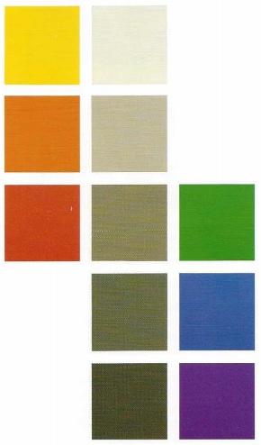
Here, each of the primary and secondary colors is accompanied by a tint (to the right of each hue) and a shade (to the left of each). A tint is a mixture of a pure color and white; a shade is a mixture of a pure color and black. It is helpful when you are mixing colors to see the pure color within its tint or shade.
Complementary Colors
Colors opposite each other on the color wheel are said to be complementary. Red, for example, is opposite green and is therefore green's complement. Blue and orange, yellow and violet, and blue-green and red-orange are other complementary pairs. When complementary colors are placed near each other they appear brighter and more intense than when placed near any other colors. Red looks redder near a green, and vice versa. Warm and cool colors accentuate each other in a similar way, although not as strongly.
Color Intensity
A color is at its most intense when pure-when it is not a tint or shade. Adding black, gray, or white means the color becomes less intense but retains its original character. For example, red with some white added is still red, but a less intense red (Adding another color to the red-say, yellow, changes its hue to orange.) Adding a small amount of the color's complement to it also lessens its intensity, or neutralizes it, without changing its essential hue. In theory, any two complementary colors mixed in equal proportions will produce gray, the most neutralized a color can become. (In practice, due to the variability of pigments, this is rarely the case.)
Note what happens when we place each of the six hues of the color wheel-the three primaries and the three secondaries against its complement. The color seems most intense when juxtaposed with its complement.
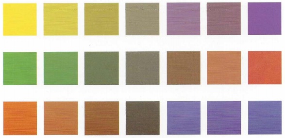
Theoretically, equal mixtures of complements will produce gray. Here, colors on the left are mixed in gradual steps with those or right their complements. Note how the intensity of a color is reduced when some of its complement is added to it. This neutralizing effect is useful when you want to make a color appear to recede in a composition, or convey specific effects of light and shadow on a color.
Neutralized Color
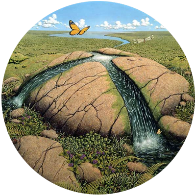
To convey distance, color is used at its most intense in the foreground of a composition and is diminished in intensity as it recedes toward the background. This is especially effective when you want to indicate the distance between two objects of the same or similar color. Imagine a field of yellow-orange poppies all in the same light. The poppies in the foreground are purer-more intense-in color than those in the background. As they recede farther into the distance, they appear more neutral in color. In a painting, you can achieve this by adding trace amounts of the color's complement to neutralize it. All neutralized colors will, when compared to their purer form, appear to recede. Adding black, white, or gray is another way to neutralize a color, but a less effective and less elegant one.
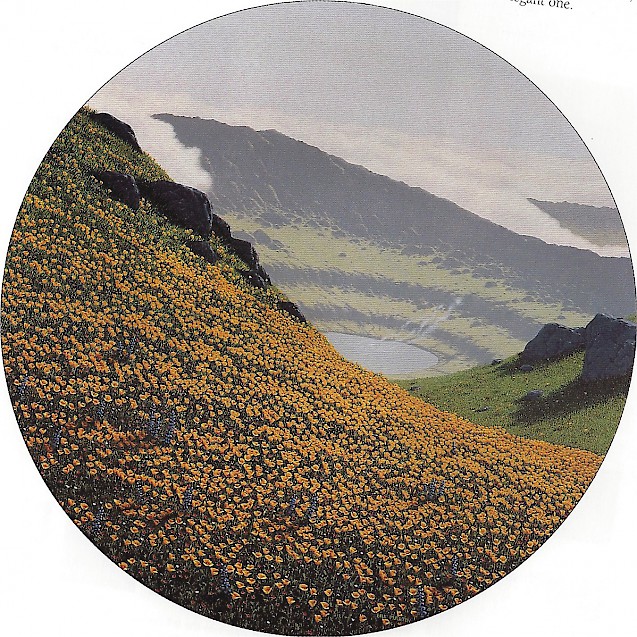
POPPIES, OIL ON CANVAS, 24" (61 CM) DIAMETER
The color of the poppies is more intense (purer) in the foreground than in the background, where their color has been neutralized slightly by the addition of its complement When you add to a given color a trace of itl complement, the color appears to recede.
Color in Light and Shadow
Colors become neutralized in bright light, in shadow, in cast shadows, and in objects seen behind glass, under water, or in the distance.
The color of the light changes the color of the object. Sunlight is a pale yellow-orange. Light on an overcast day is blue-gray. A green tree in sunlight will appear more yellow-green than the same tree in overcast light, which will seem more blue-green. In painting, the color of the light is added to the light side of the objects depicted.
The color of a shadow or cast shadow includes the complement of the color of the light. For example, if the sunlight in a particular scene is yellow-orange, the shadows and cast shadows of objects illuminated by this sunlight will include blue-violet (the complement of yellow-orange), As the sun sets it often creates an orange light; the next time you see this happen, watch the cast shadows on a white surface turn blue.
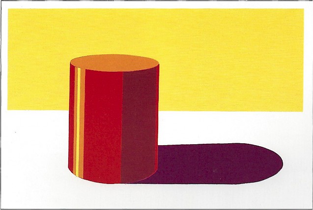
This red cylinder is illuminated by yellow light. Violet, the complement of yellow, is added to the shadow side of the cylinder, where it mixes with the form's local, or actual, color to become a muted red-violet. The cylinder's cast shadow on a white surface has much violet in it.
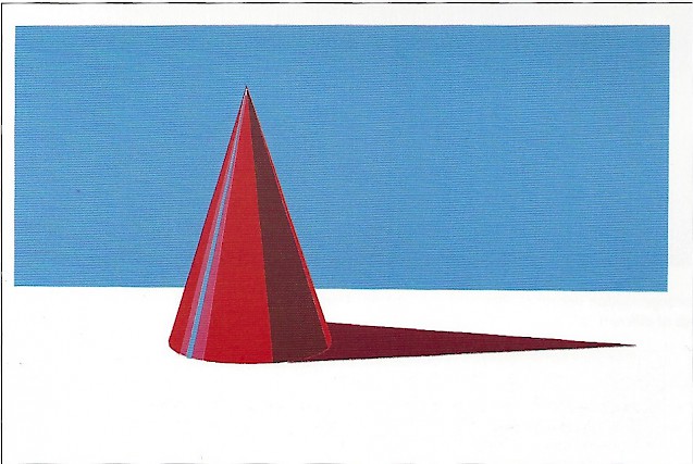
This red cone is illuminated by blue light. Its shadow side has orange added to it, as does the cast shadow. Look for the complement of the light's color in shadows and cast shadows.
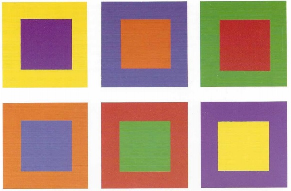
Color Relativity
Colors are greatly influenced by the value and hue of colors around them, as the illustrations on these two pages show. When it is important that a color appear the same in areas with different color or value backgrounds, it is necessary to alter the original color so that it appears to stay the same. (You have to lie to tell the truth.)
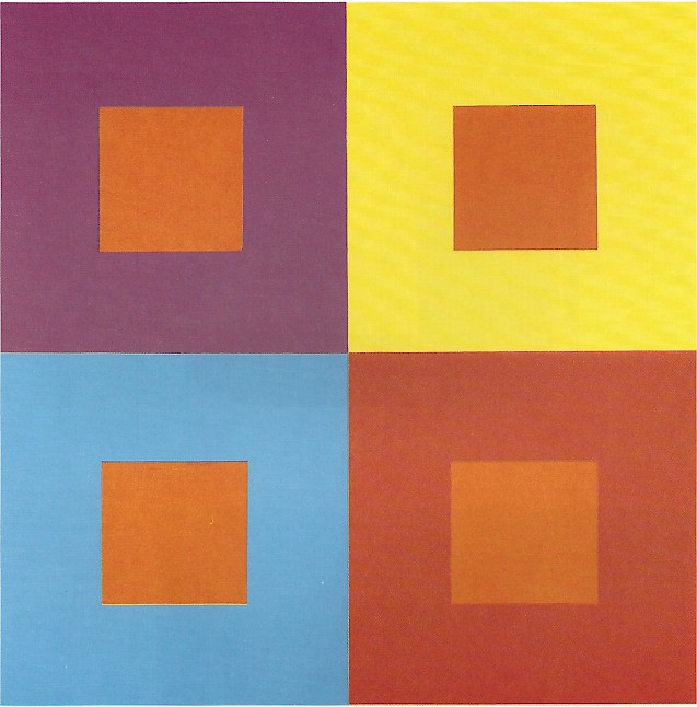
Notice how four identical orange squares appear to differ from one another when placed against backgrounds of different colors.
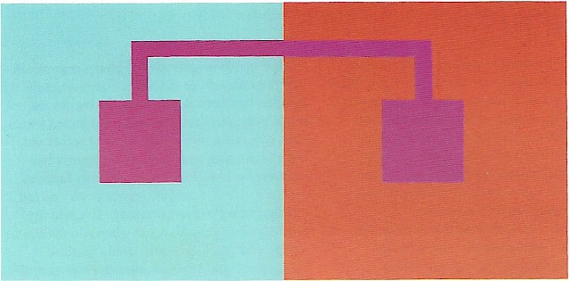
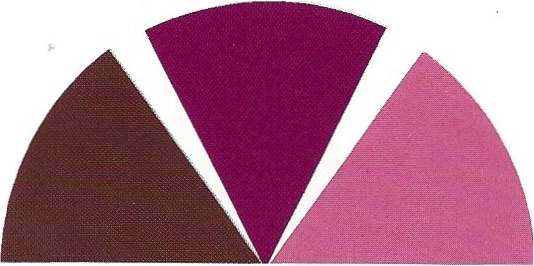
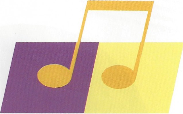
Note how the red-violet shape appears to be redder against the blue half of the background and bluer against the red half.
Cover the top part of the yellow.orange shape with your hand and note how the remainder appears to change value against the different backgrounds.
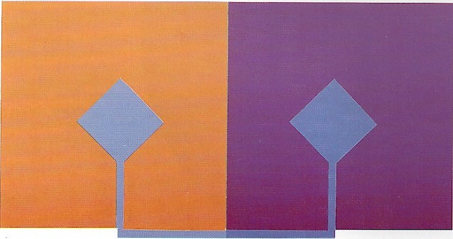
At first glance the blue diamonds appear to be the same color, but if you look along the bottom margin, you will see that they are not identical. The blue at right, against the violet background, has been slightly altered to make it appear the same as the blue at left. The alteration compensates for the effects caused by the different background colors.