
Color in Composition
As noted in the previous chapter, color is the third layer of composition. For our purposes black, gray, and while are considered values, not colors; thus, a picture rendered only in these tones does not use the principles of color composition. As we saw in the previous chapter, there are specific ways to handle line, value, and texture in composition that draw the viewer in and convey the artist's message successfully. So, too, with color, in terms of both placement and combination.
A color that is unlike any other in a composition will draw attention and therefore requires careful placement. Use a unique color where you want to direct the viewer's eye. You can also use a unique color as an accent to enliven a picture. if a unique color is placed too near an edge or a corner, the eye will be attracted there and thus leave the composition. If such an awkward placement is unavoidable, it is helpful to place another unique color m a position opposite the first. For example, if a unique color directs the eye to the extreme right side of the composition, another unique color on the left side will help to bring it back.
There are many ways to organize the colors in a composition, but essentially there are just four basic schemes: monochromatic, complementary, analogous, and triadic. These four are adequate for most situations, and each has its own influence on the mood of a picture.
Monochromatic Color Schemes
Monochromatic means one color and includes the light, middle, and dark values of that color. There IS usually no difficult y in harmonizing a monochromatic color scheme and little concern about the placement of odd colors. The mood created with this scheme is usually simple and direct, and its specific meaning depends on the color chosen. For example, using mostly middle values of a yellow-orange conveys a sense of pervasive warmth and security. It would be difficult to create a frightening picture using this color without dramatically shifting the values and/or using a lor of diagonals in the linear composition. Using blue-green, however, would result in a feeling of cool detachment, while red-violet would suggest sensuality. The meanings of colors are, of course, subject to personal, political, and cultural interpretation.
 MORNING DEW; GOUACHE ON PAPER, 12 X 16" (30.5 X 40.6 CM).
This is an example of a monochromatic color scheme. One dominant color is used, along with its tints and shades.
Complementary Color Schemes
As we have seen, colors directly opposite each other on the color wheel are called complements. A color will appear its strongest and brightest next to its complement. Thus, a complementary color scheme is used when strong impact and drama are desired. Complements can be used as accents, as in a small red ball on a large green field, or used as near equals, as in autumn's orange leaves against the blue of the sky. In both cases the intensity of each color is increased by the presence of its complement. Complementary colors need not be of similar value or intensity to enhance each other or function effectively in a composition. For example, a dark, muted blue will still complement a bright orange. Even two muted complements will accent each other.
Warm and cool colors can also complement each other. For instance, blue is a cool complement to red's warmth. This is not as strong a relationship as the contrast between two true complements, such as blue and orange. Yet juxtaposing colors of different temperatures can result in interesting compositional effects with impact and drama.
A variation of a complementary color scheme is the split-complementary scheme. For example, red and green are complementary colors; a split complementary color scheme based on those colors would include red plus yellow-green and blue-green, or green plus red-violet and red-orange.

Orange and blue are the dominant colors in this complementary color scheme. I chose these colors to give extra strength to what is actually a very simple composition. In this and the following accompanying diagrams, color names are abbreviated this way: Y=yellow, R=red, B=blue, O=orange, V-violet. G=green, YO=yellow-orange, and so on.

VERY COLD WATER, GOUACHE ON PAPER, 16 X 12" (40.6 X 30.5 CM).

To emphasize the importance of the flowers in this painting, I heightened the intensity and warmth of their red-violet color by juxtaposing its cool complement, blue-green.
 ARTIST'S CACTUS, GOUACHE ON PAPER, 12 X 16' (30.5 X 40.6 CM).

To depict the fallen leaves from my sister-in-Iaw's tree, I used a split-complementary color scheme of red-orange, red-violet, and green. Adding some green leaves to the composition provided an accent and intensified the other colors.

CYNTHIA'S LEAVES, GOUACHE ON PAPER, 12 X 16' (30.5 X 40.6 CM).
Analogous Color Schemes
Colors close to each other on the color wheel are called analogous. For example, red, red-orange, and orange represent an analogous group. Analogous colors have the buill-in harmony of a shared color; in the example given, all three colors have red in common. An analogous color scheme uses three to five neighboring colors on the color wheel. As with monochromatic color schemes, analogous colors create simple moods in a composition. However, while a monochromatic scheme can sometimes look like a black-and-white picture that has been toned with a single color, an analogous scheme involves a greater range of colors, allowing for increased subtlety and emotional expression. Blues and violets tend to create a quiet, somber mood; reds, yellows, and oranges tend to create cheerfulness and exuberance; greens imply calm. Occasionally a color from the opposite side of the color wheel is used as an accent.

To convey the coldness and quietness of this subject I used a cool analogous color scheme consisting of blue, blue-violet, and blue-green.

AURORA, OIL ON CANVAS, 30 X 60" (76.2 X 152.4 CM).
Triadic Color Schemes
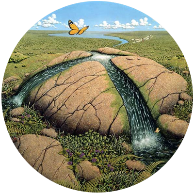
Any three colors that form an equal-sided triangle on the color wheel are considered triadic. Red, yellow, and blue is a triadic color scheme, as is violet, orange, and green. Triadic colors tend to create a mood of cheerfulness and buoyancy, which is why they are often used in children's toys. The purer (more intense) the colors are, the more pronounced the effect.
Numerous variations in color composition are possible. In a composition that uses many colors, those that dominate define the main color scheme; other color schemes may be used in conjunction with the principal one for special effects. An awareness of the effects color has on you and your audience is a necessity. And, as with the linear, value, and textural elements of composition, the sizes and shapes of colors are most interesting when they are varied. Generally, some repetition of colors will add internal harmony to the composition.

Although the scene itself dictated my choice of colors, a triadic scheme of red, yellow, and blue, I decided to emphasize the colors' strength to make the viewer feel good about rocks.
 PETRIFIED SAND, GOUACHE ON PAPER, 12 X 16" (30.5 X 40.6 CM).